As Saris’ long-time partners (and a building full of two-wheel enthusiasts), we’ve had the pleasure of working together on website redesigns, product naming and everything in between.
Most recently, we took on the exciting challenge of helping Saris evolve their existing logo.
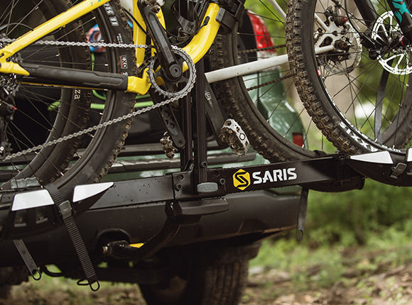
Given that Saris keeps bikes at the heart of everything they do, this redesign was one piece of a greater initiative to ensure the Saris story was told loud, proud and crystal clear across all touchpoints, including one of the most key placements – their own product.
Redesigning the existing logo also opened the door to better representing the high level of quality and thoughtful design invested in every Saris rack, trainer, power meter and cycling structure.
Additionally, we knew there was an opportunity around increasing readability and presence of the logo on products and packaging while also giving a nod to the heritage of the name “Saris”: a combination of the founders’ names … Sarah + Chris = Saris
Armed with those insights and a few others, we set out to create an ownable mark that would both stand out in a crowded competitive set and aptly represent the brand’s story and passion for the cycling industry and community.
The result was a fresh, modernized update that pays homage to Saris’ meticulous craftsmanship, unique heritage and authentic drive to keep bike lovers moving forward.

